TBWA 2.0
TBWA
TBWA\Chiat\Day LA
The Challenge
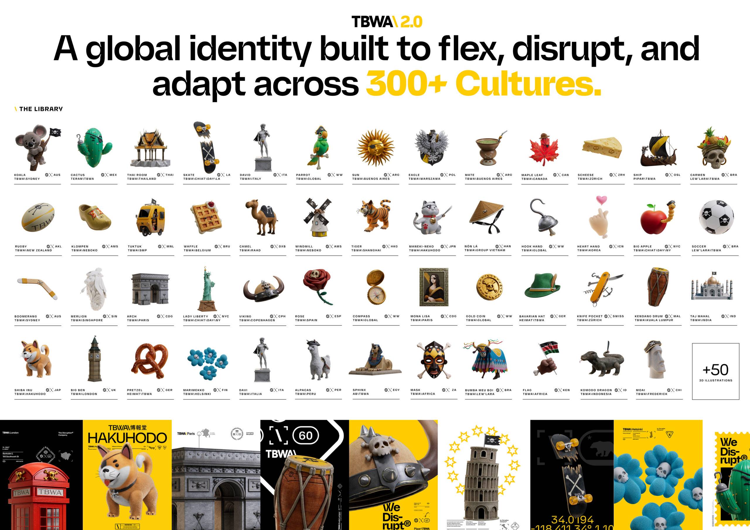
TBWA operates across more than 300 offices worldwide, each deeply rooted in its local culture. The challenge wasn’t just to refresh the brand—it was to create a system that could flex, react, and feel alive in every market without compromising its global identity. Rather than imposing a rigid template, we built a living system where typography shifts based on cultural context—stretching, tightening, and adapting. The result: a visual identity that mirrors how TBWA truly operates—disruptive, dynamic, and culturally attuned. This wasn’t a cosmetic update; it was a full evolution of the brand’s behavior.
The Solution
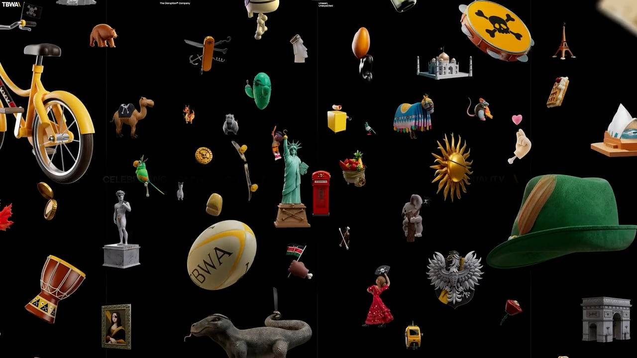
TBWA is built on cultural proximity—every office disrupts differently. To celebrate that, we created a collection of custom 3D icons, each crafted to capture the spirit of a place with humor, rebellion, and edge. These weren’t generic symbols—they were cultural portraits: a golden Dutch clog, a tropical skull crowned in fruit (hello, Captain Miranda!), a raccoon with street-fighting spirit.
Each office got to represent its culture not through logos or slogans, but through bold, dimensional icons that felt raw, local, and unmistakably TBWA. In a world where brands often flatten cultural expression, this approach gave every market a way to disrupt visually—while staying connected to a global brand that moves with the world, not against it.
Watch the Case Study
The Results
This approach transformed the brand from a static system into a living identity. Adoption across offices was fast, organic, and enthusiastic. TBWA’s new visual world boosted cultural relevance while maintaining global cohesion—reinforcing the agency’s position as a true disruptor. Rather than forcing the world to fit into a brand system, TBWA built a system designed to move with the world—and stay ahead of it.

