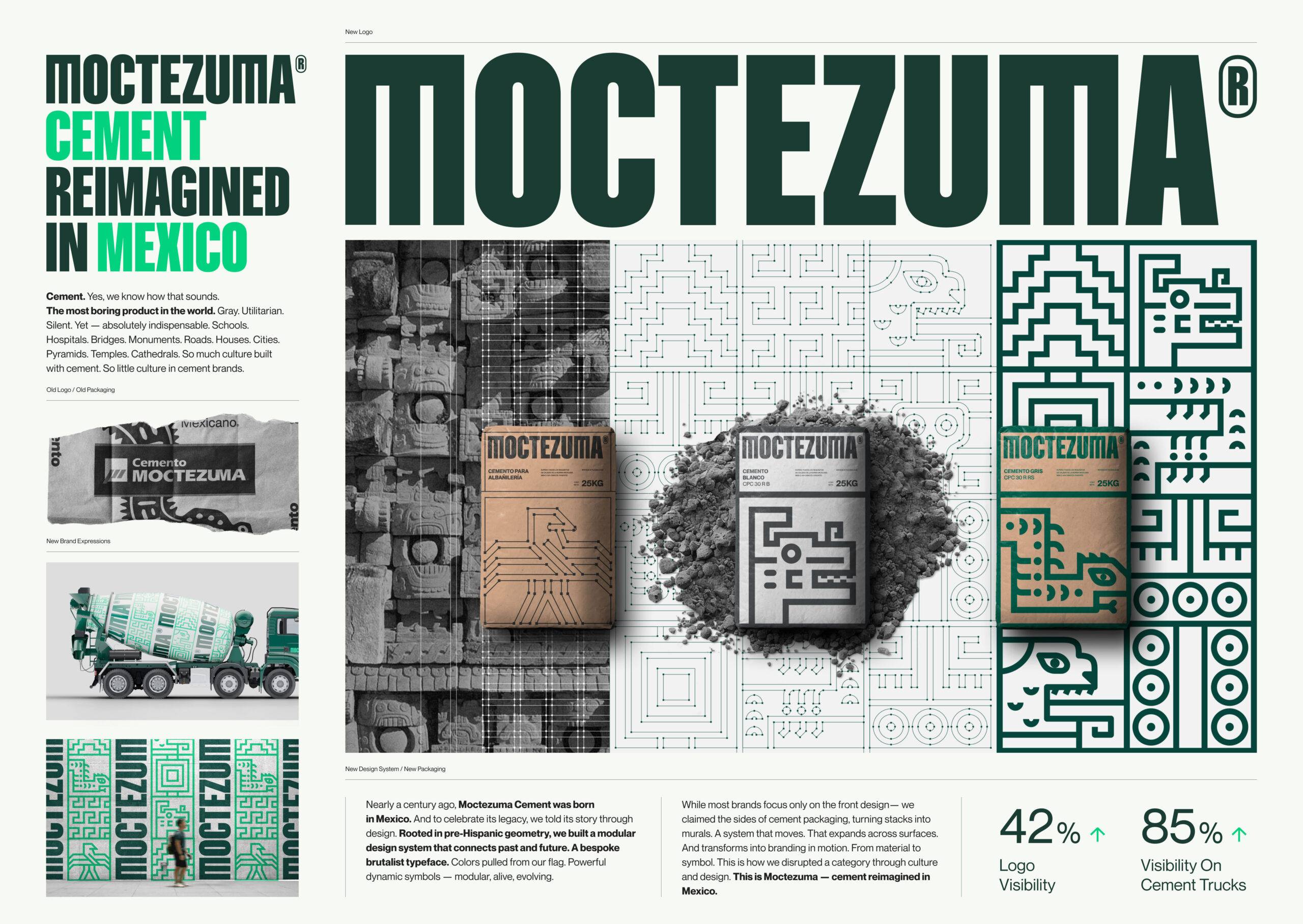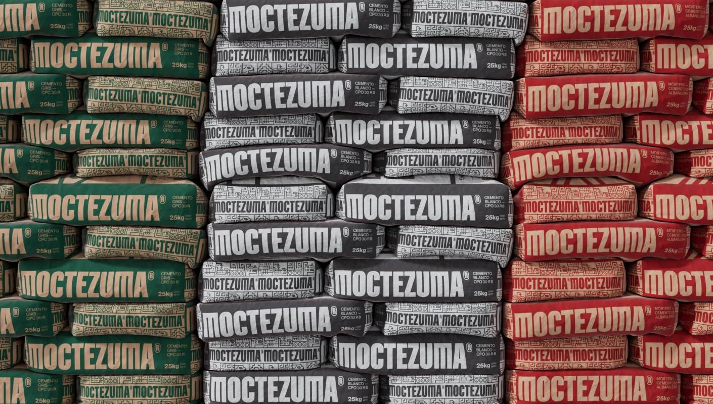
Moctezuma — Cement Reimagined In Mexico
Corporación Moctezuma
Brands&People
The Challenge
80 Years of Legacy, No Visibility
Moctezuma Cement has been building Mexico’s foundation for over 80 years. Named after an iconic Aztec emperor, it’s deeply rooted in the country’s history. With a presence in 700+ locations, the brand is recognized and trusted by builders, workers, and vendors.
Category of Sameness
The cement category was visually stuck. Most brands relied on the same palette of blue and red, with functional, disposable packaging. Branding was minimal and forgettable. In this low-interest space, Moctezuma saw an opportunity to lead with meaning.
Mexico Was Changing, Cement Wasn’t
Meanwhile, Mexico was evolving. Cultural pride, identity, and sustainability were becoming stronger forces. People expected more from brands—especially heritage ones. Moctezuma had to evolve—without losing the story it had already built.
The Solution
Moctezuma’s Potential
The idea was simple: treat cement not as a commodity, but as a cultural symbol. Named after Moctezuma—the Aztec emperor of legacy and permanence—the brand had history in its DNA, but lacked a visual identity to match.
Pre-Hispanic Geometry
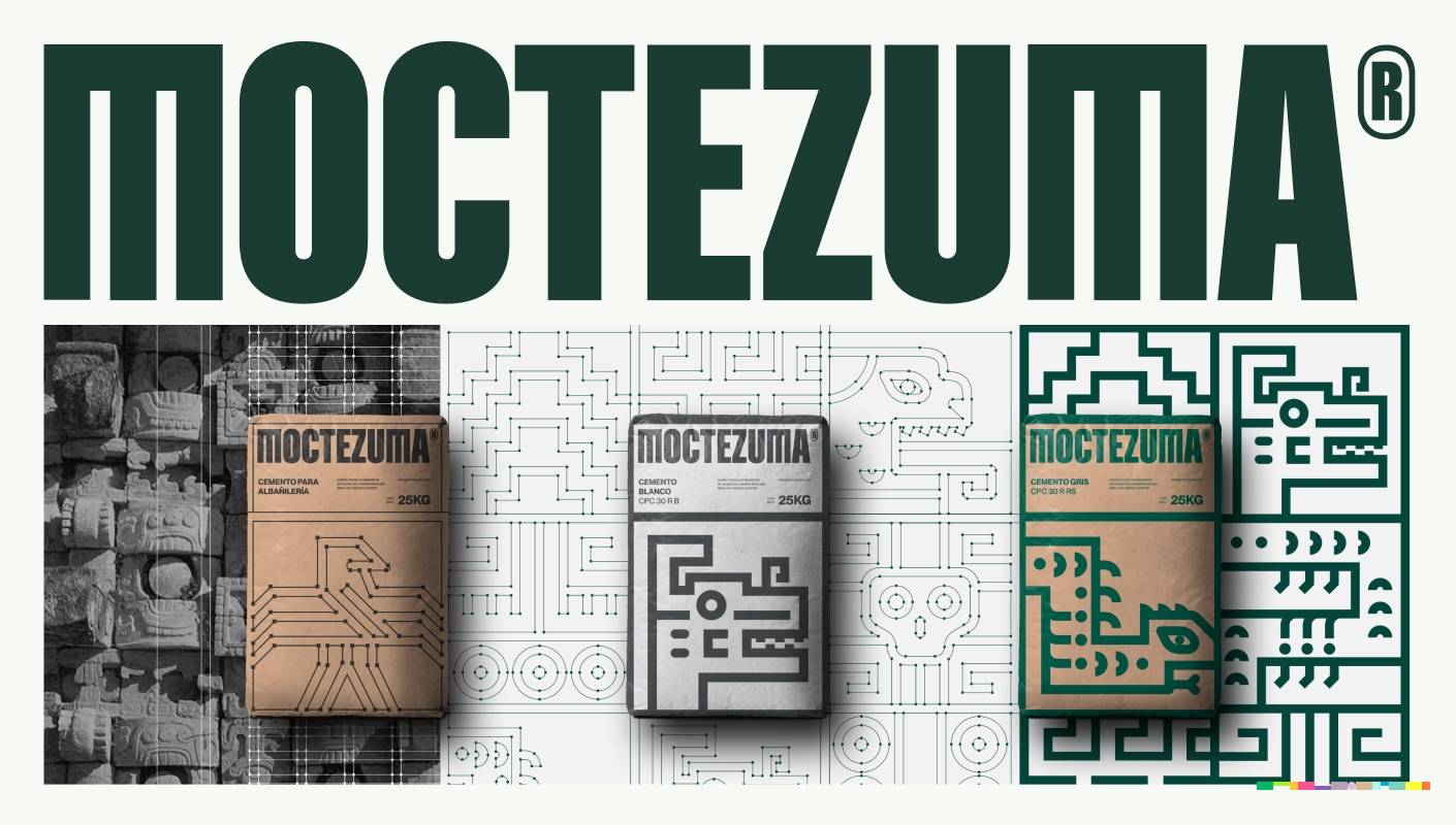
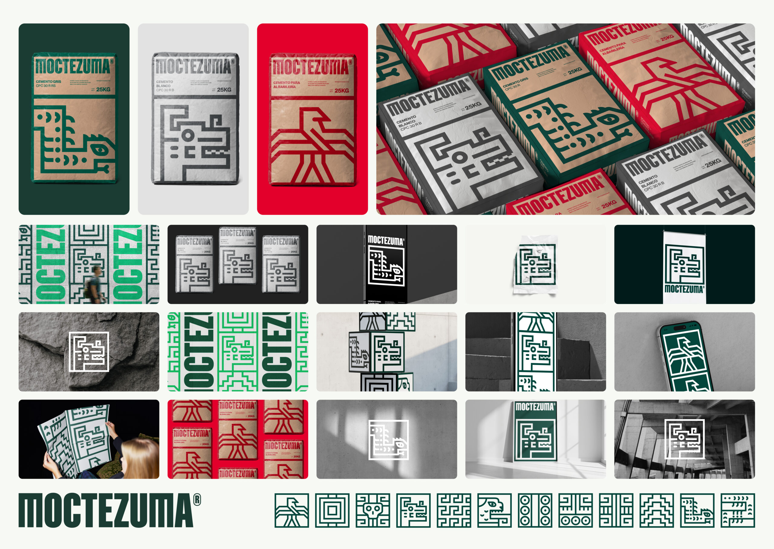
Brands&People created a modular design system rooted in Mexican heritage, inspired by pre-Hispanic geometry, stone mosaics, and reimagined symbols. Each symbol embodied a value—strength, transformation, or progress—anchoring the brand in cultural meaning.
Cement Bags Becoming Murals
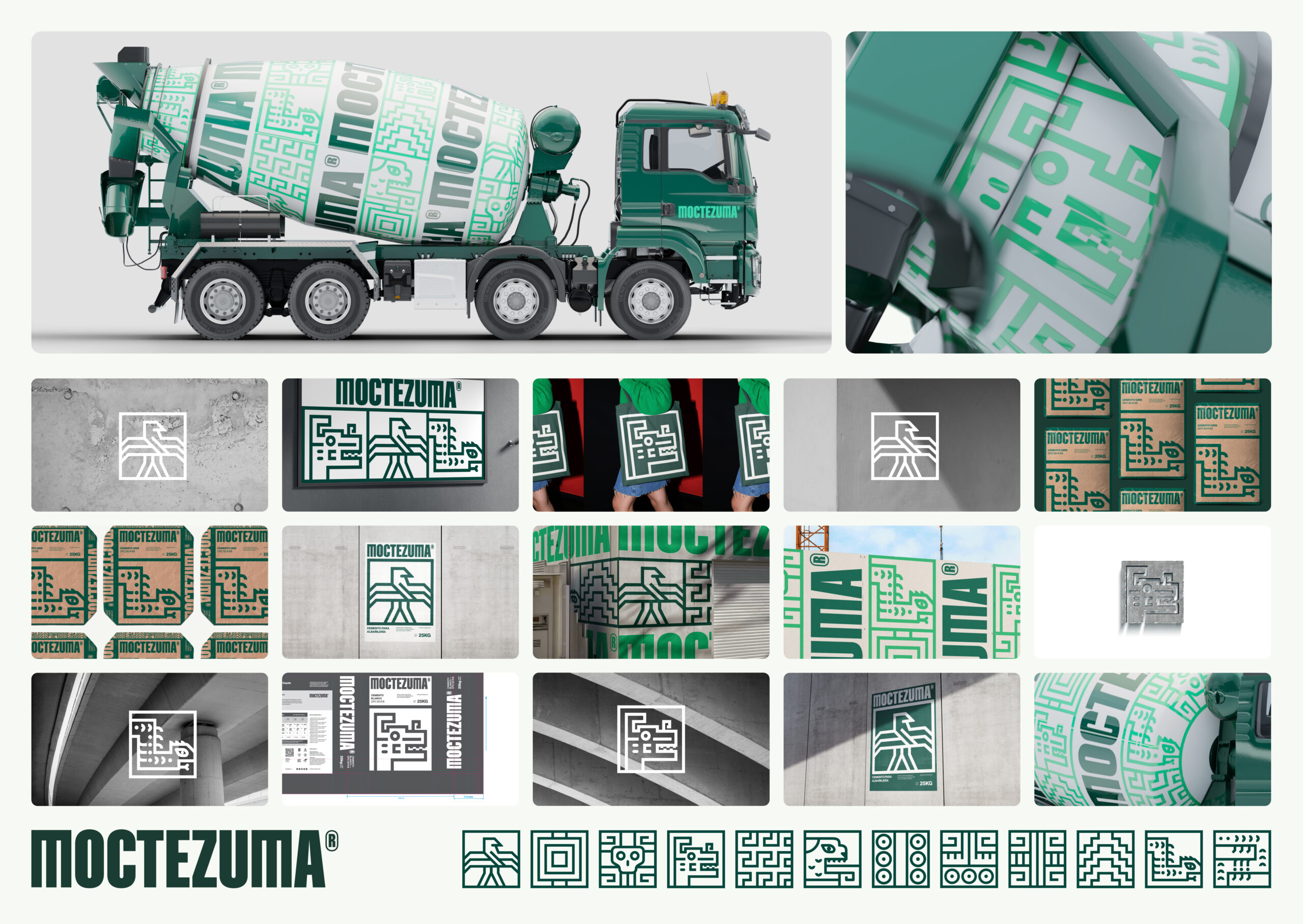
Stacked cement bags became storytelling tools. Side panels—the most visible part of the packaging—were transformed into modular murals. What was once overlooked became iconic.
Modular Design System
Every design element reflected core values: strength, legacy, transcendence. The identity connected with builders, vendors, and users alike. It gave the brand voice, visibility, and dignity. Cement can carry culture.
Watch the Case Study
The Results
The system was embraced by the C-suite, investors, and all departments—aligning teams under one unified visual language after years of fragmentation.
Before any major paid campaign launched, the rebrand generated unpaid editorial coverage in over 20 national outlets. The design became the story—proving its cultural relevance from day one.
